

The Wellness Boutique
Brand Refresh & Identity System
The Wellness Boutique (TWB) is a women's health physiotherapy and Pilates studio in Burleigh Heads, dedicated to supporting women through every stage of life, pregnancy, postpartum, and beyond. Founder Danni came to us with a clear problem: the studio's care was already exceptional, but the brand wasn't speaking the same language. It read clinical where it needed to feel like a sanctuary. Generic where it needed to feel like her.
She didn't want another sterile healthcare brand. She wanted something that felt like a retreat, warm, considered, and unmistakably premium, without losing an ounce of clinical credibility.
The BriefIdentity Suite
Primary, secondary, and tagline logos, plus a standalone logomark (TWB) and circular brand mark for versatile, small-scale use
Colour System
A tiered primary, secondary, tertiary, and accent palette, engineered for both print permanence and social media flexibility
Typography System
A considered pairing of display and body fonts with a full hierarchy, from H1 headings to button states
Photography & Art Direction
Guidelines for tone, model inclusivity, colour grading, and composition across lifestyle and product imagery
Illustration & Pattern Library
A custom hand-drawn illustration style, extendable to seasonal campaigns
Applied Collateral
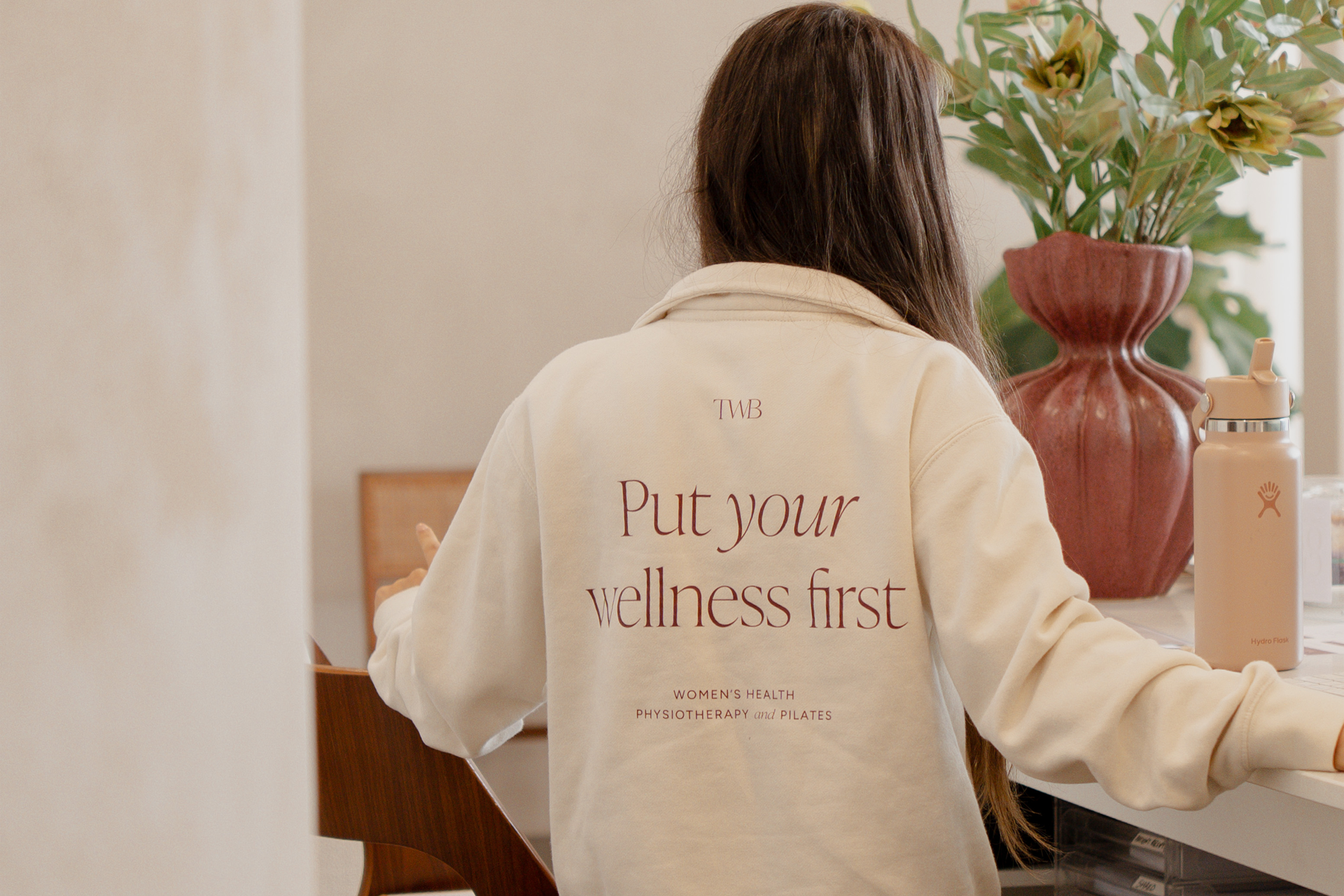
Social media templates (carousels, statics, reel covers), print collateral, signage, apparel, email marketing templates, and website mockups
Full Brand Guidelines Document
A comprehensive reference toolkit so the brand stays consistent as the studio scales
IndustryWomen's Health — Physiotherapy & Pilates
LocationBurleigh Heads, QLD, Australia
Scope of WorkWe started where every good brand should: with listening. Through early conversations with Danni, it became clear TWB's real point of difference wasn't just its services; it was its philosophy. This is a studio built to normalise change, honour every body, and hold space for women at the moments they're often made to feel unseen.
From there, our process moved from mood and meaning before it ever touched a logo. We built a visual direction around three pillars, grounded and warm, earthy and organic, artistic and textural, and tested every subsequent decision against them. Danni stayed close throughout, reviewing at each milestone so the brand grew with her business rather than being handed to it. What came out the other side wasn't just a logo suite; it was a full system built to flex across a clinic, a studio floor, a Reels cover, and a reformer class flyer, without ever losing its throughline.
Our Approach★★★★★
“The design look great, thank you so much! “
– Danni G. / Director & Senior Physiotherapist