

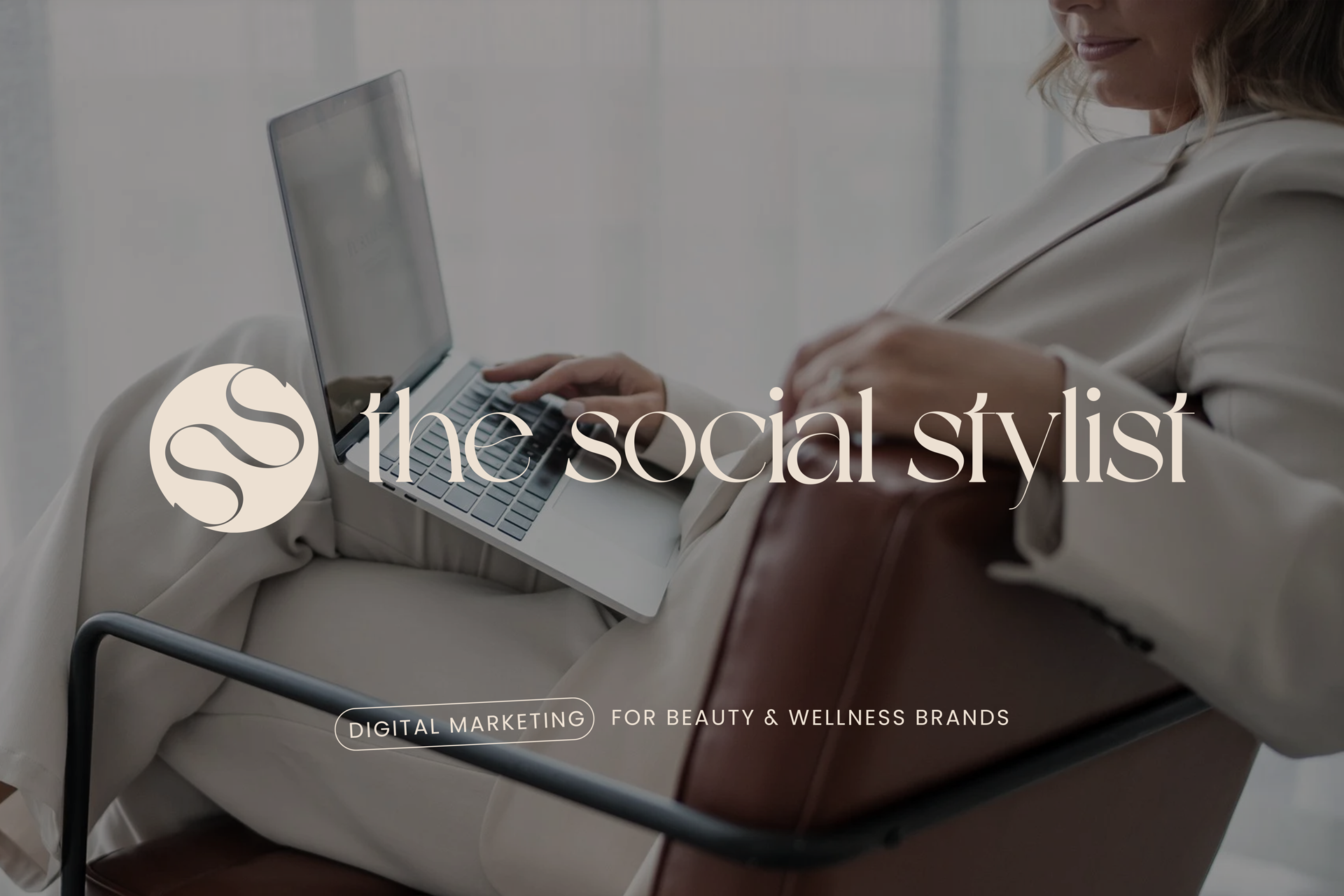
Visual Identity RefreshThe Social Stylist
Digital marketing for beauty and wellness brands.
The BriefThe Social Stylist is a digital marketing consultancy built specifically for beauty and wellness businesses. Founded by Celina in 2019, it has grown into a trusted partner for skin clinics, salons, pilates studios and aesthetics practices across Australia, not as an agency, but as one person who genuinely knows the industry inside out.
That is the point of difference: no explaining what RF needling is, no generic captions. Clients come to The Social Stylist because they want marketing that sounds like it was written by someone who has actually spent time in a clinic, is considered warm, and fluent in an industry most agencies only skim the surface of.
We partnered with The Social Stylist to refresh her visual identity from the ground up, including logo, colour palette, typography and a full set of brand guidelines built to travel across web, social and client-facing collateral.
Brand Identity Refresh
Brand Guidelines
IndustryDigital Marketing
LocationMelbourne, VIC, Australia
Scope of WorkThe existing identity was not speaking to that expertise. It needed to feel as warm, grounded and trustworthy as the service itself, soft enough for a beauty and wellness audience, but polished enough to hold its own next to the premium clinics and studios she works with.
So we built the refresh around a palette and typographic system rooted in words like nurturing, calming and grounded, a look that reads as considered rather than decorative, and that a solo founder could run herself, day to day, without needing a designer on call.
Our Approach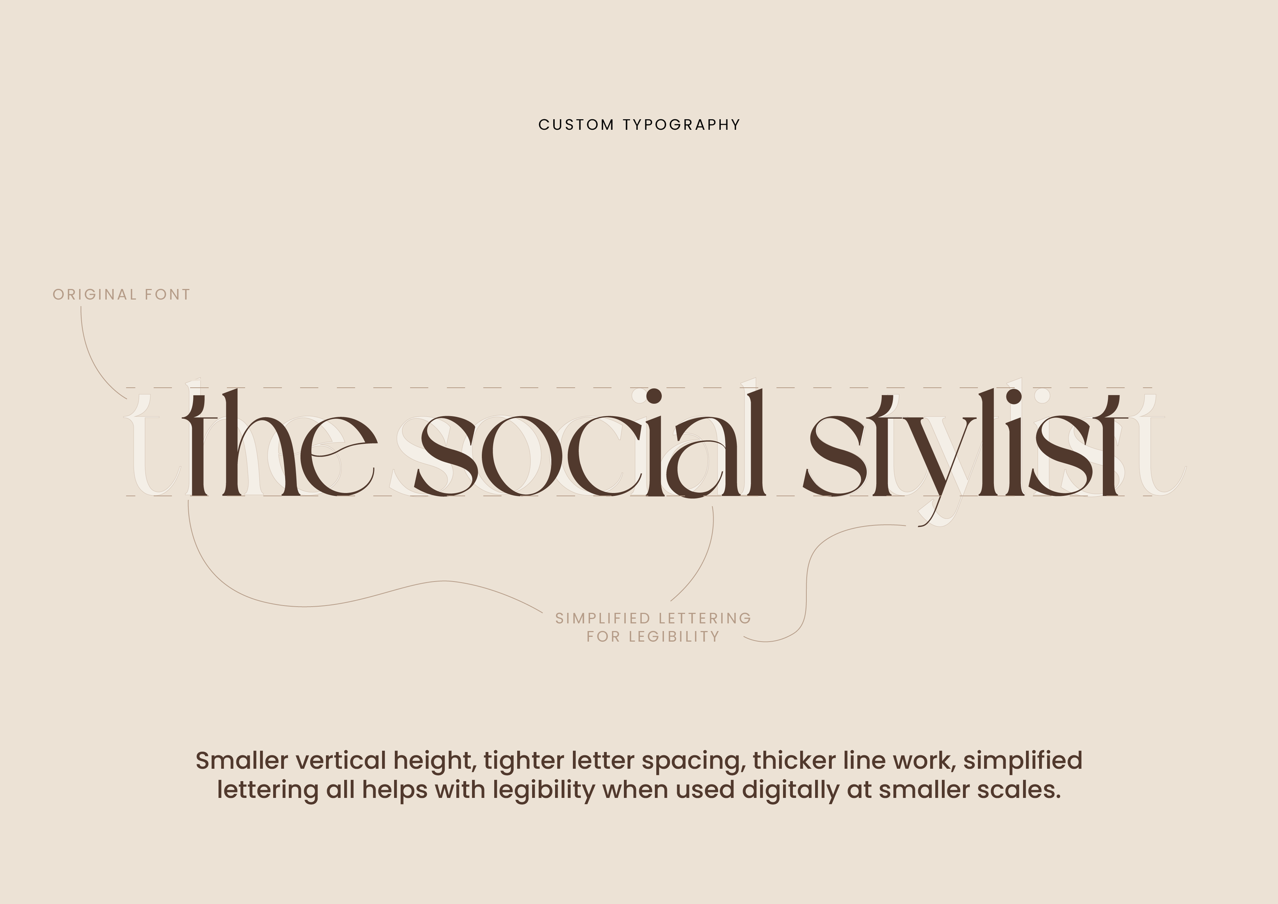
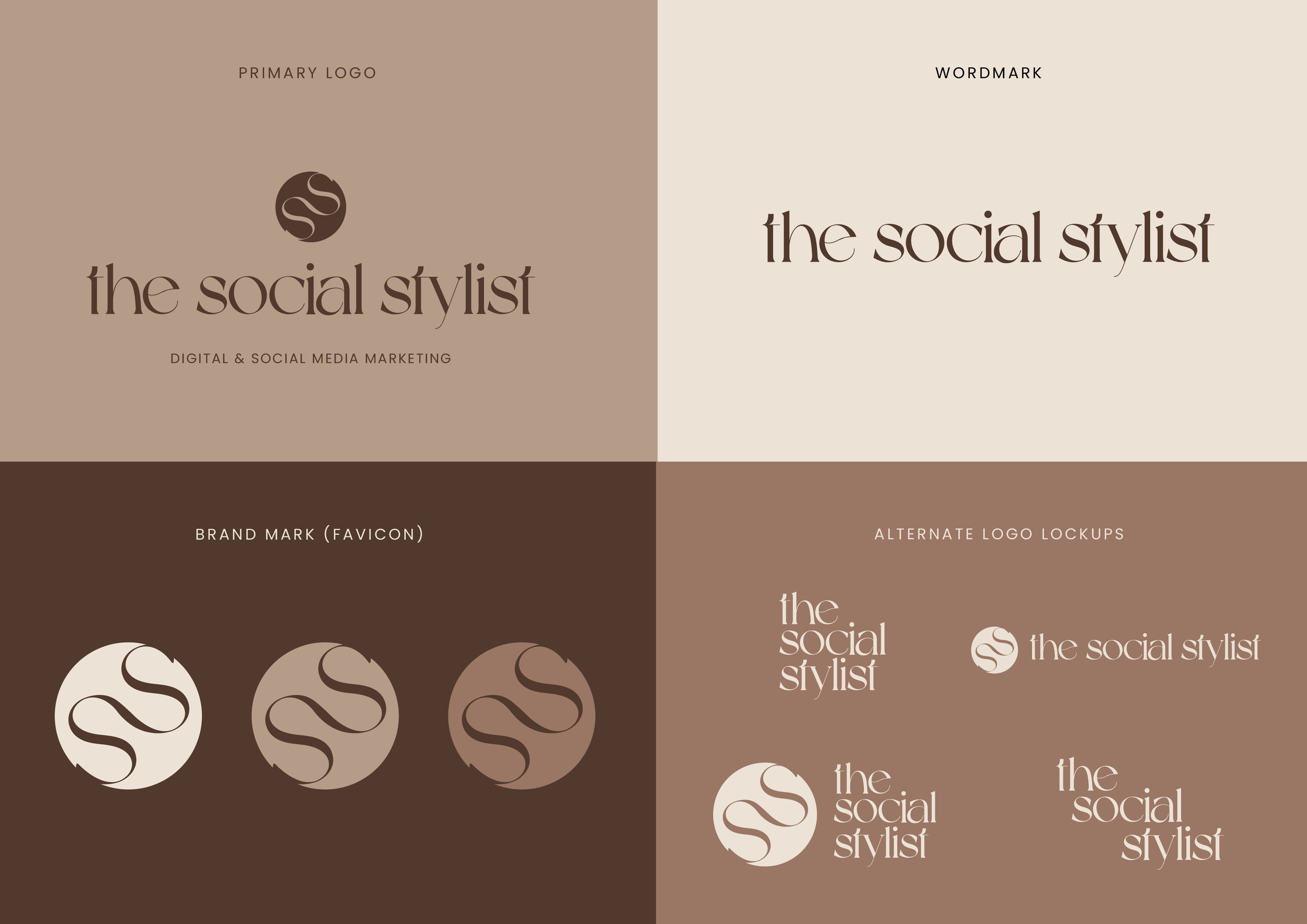
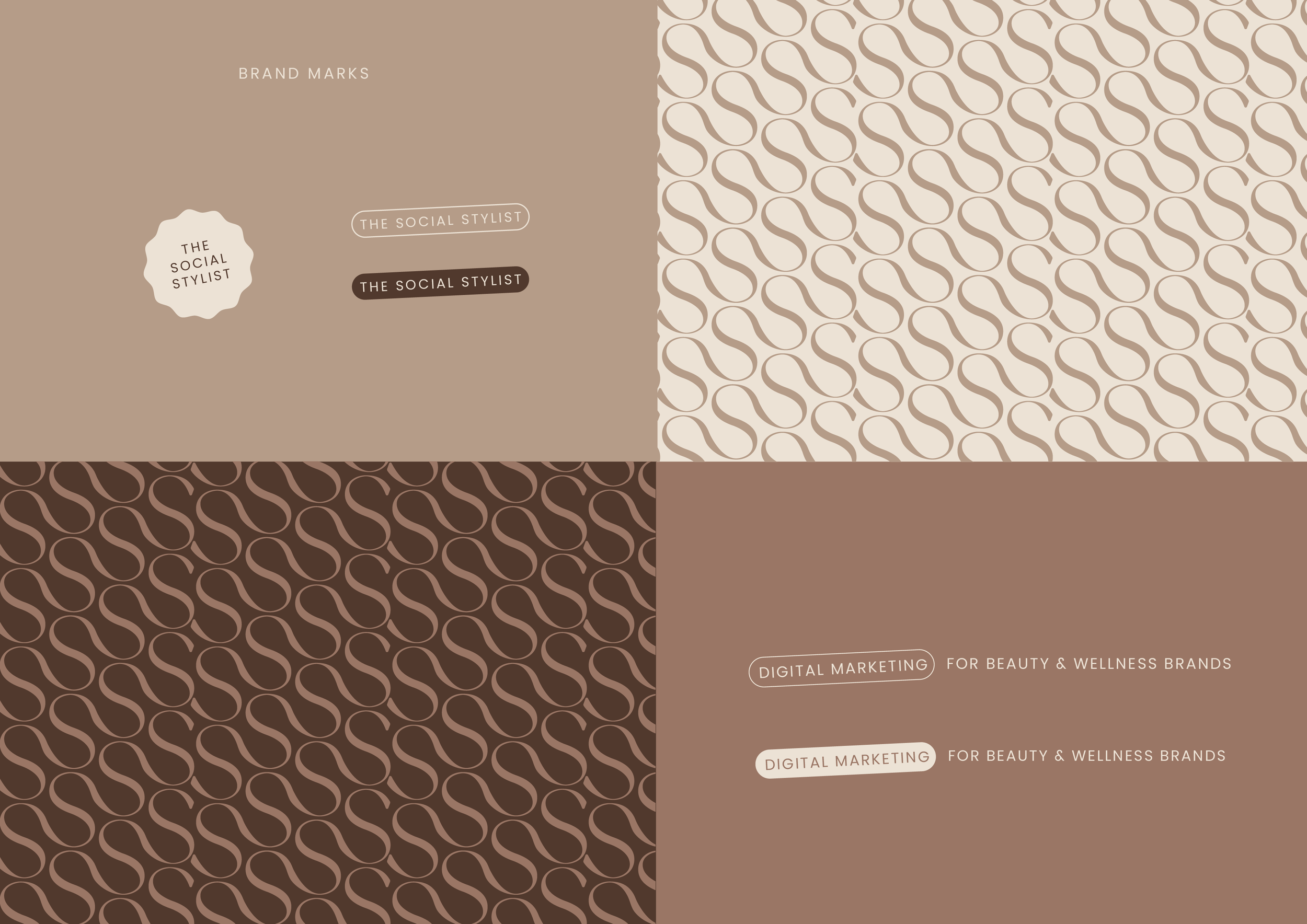
The palette centres on warm neutrals, a soft balance tone, a warm mid-brown and a grounded dark brown, with clear rules for where each sits: primary for logo and backgrounds, accent for highlights and callouts, dark for icons and inverted layouts. The custom wordmark was simplified from its original form, with a smaller vertical height, tighter spacing and thicker line work, purely so it holds up at small, digital scale, such as an Instagram grid, a favicon or a mobile nav bar.
Everything was documented with actual use in mind: light and dark mode website mockups, mobile menu states, and a type hierarchy (pre-heading, heading, body, CTA) mapped directly onto real homepage copy. The result is a system built to be self-served, and it has been. Since the handover, Celina has rolled the new branding out across her website, Instagram and studio collateral entirely on her own, with the guidelines holding up exactly as intended across every touchpoint.
Design Rationale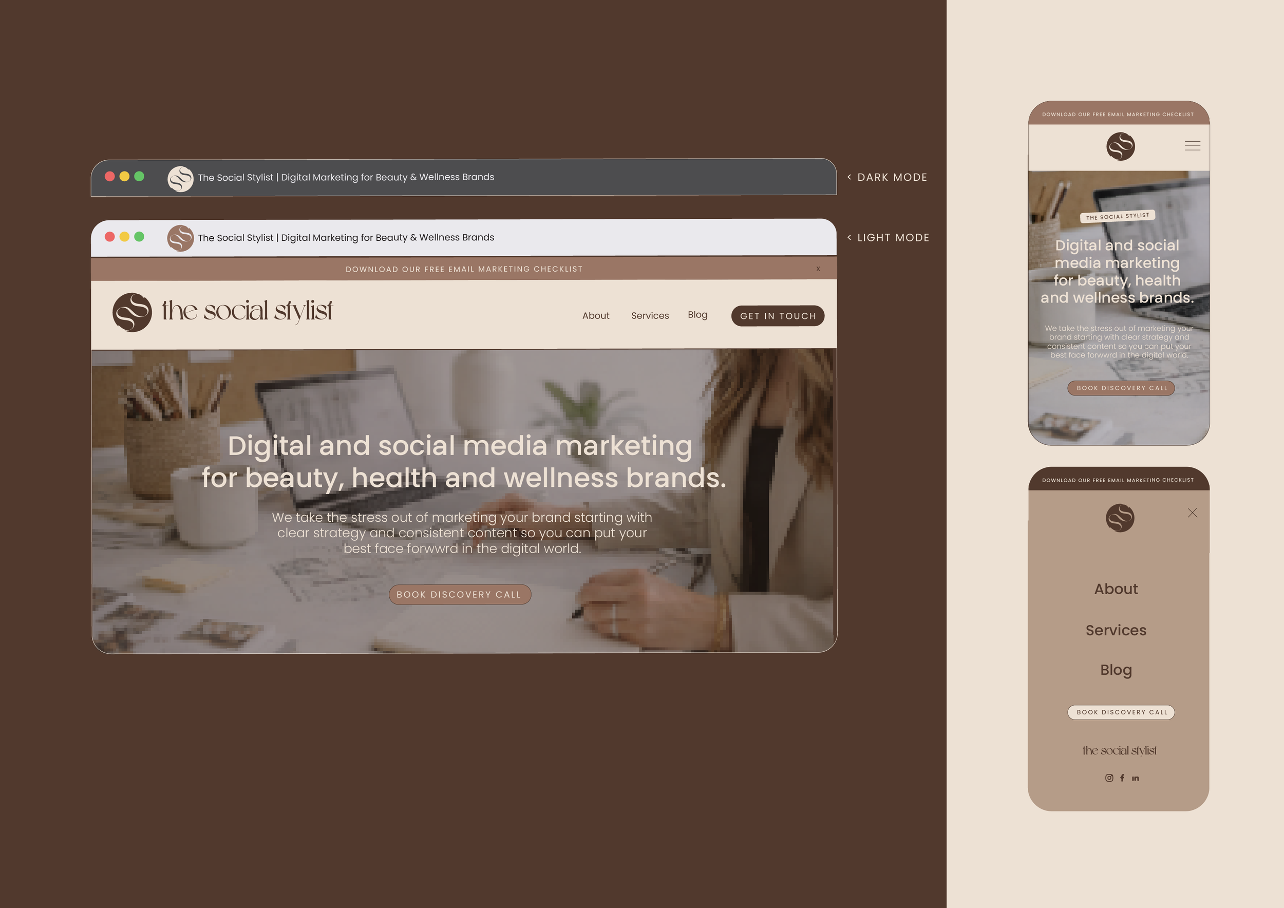
★★★★★
“I've worked with Hayley across a few projects now; most recently, she helped me refresh my logo. I came to her with a rough draft and a clear idea of what I wanted, and she absolutely nailed it. She captured the essence of my brand perfectly, elevated it and added her own creative flair in a way I couldn't have done myself.
Beyond the work itself, Hayley is just a super lovely person to collaborate with. She makes the whole process feel easy and supportive, which, as a small business owner, means a lot.
Can't recommend her highly enough! “
– Celina M. / Founder